Branding
Mirana Resort
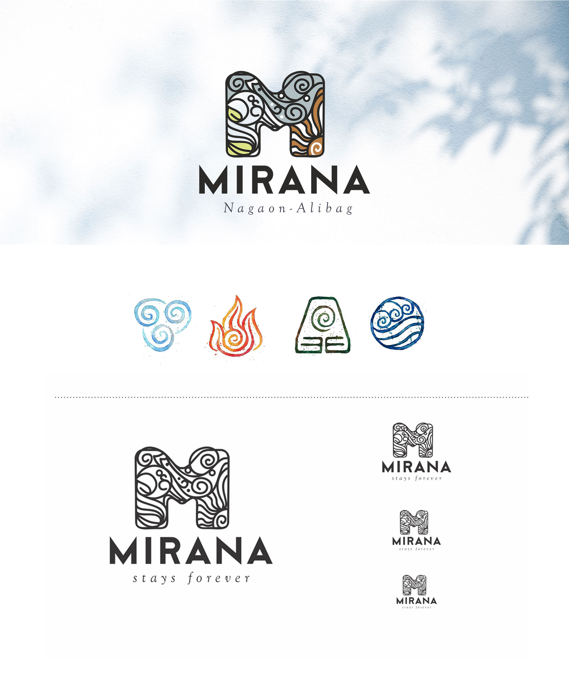
For this hospitality brand, we wanted to create a balance of Indian pride and global grace. Since Mirana is derived from a Latin word with Mediterranean connection, it was essential to capture that essence while also having a touch of our heritage. Along with that we also chose the four elements of life to portray this resort as a place where one gets to reconnect with nature and their inner self. We brought all of these together seamlessly to create a visual identity that stands out while exuding a calm vibe that is subtle and classy.
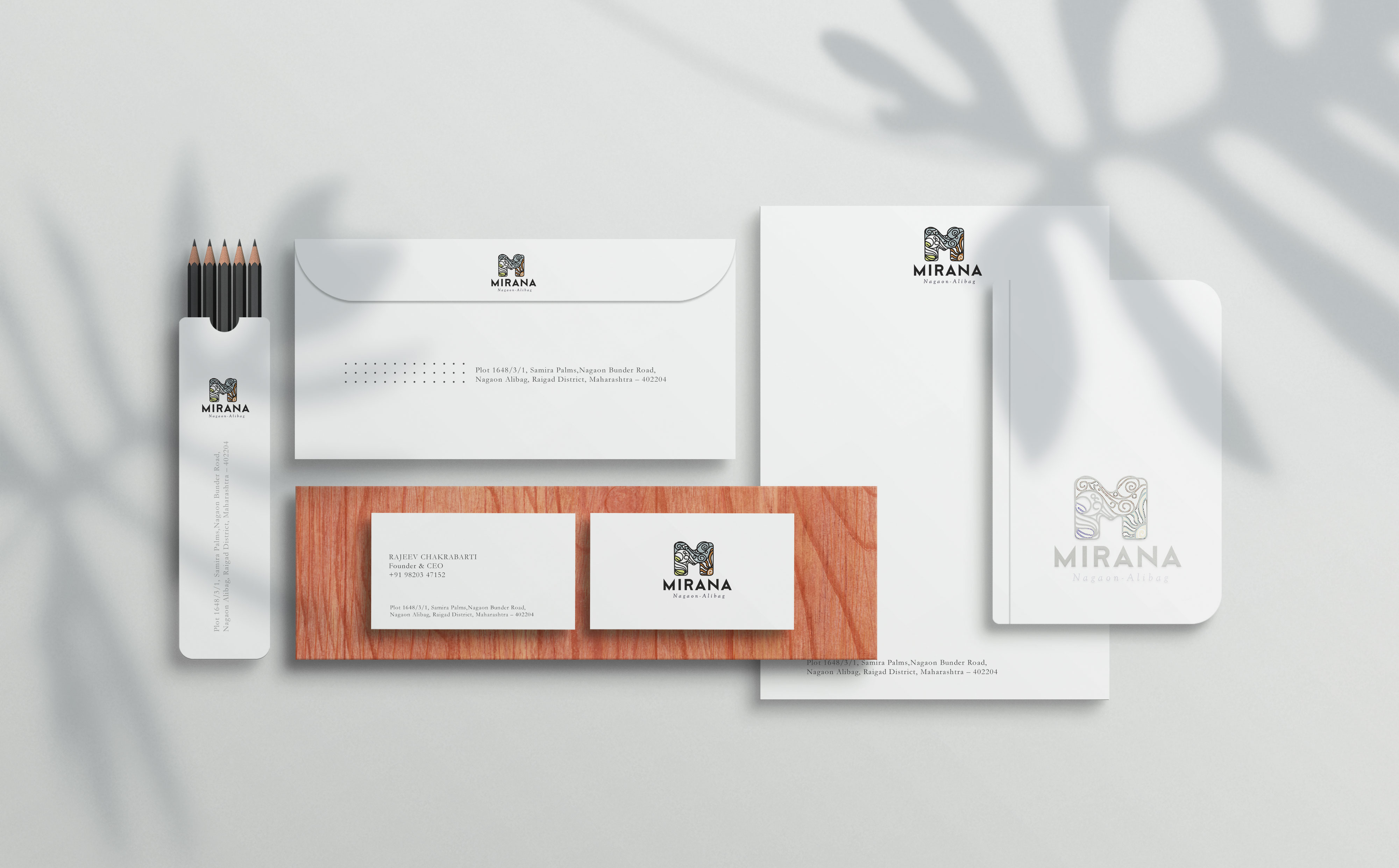
Scope: Branding, Logo Design, Collateral
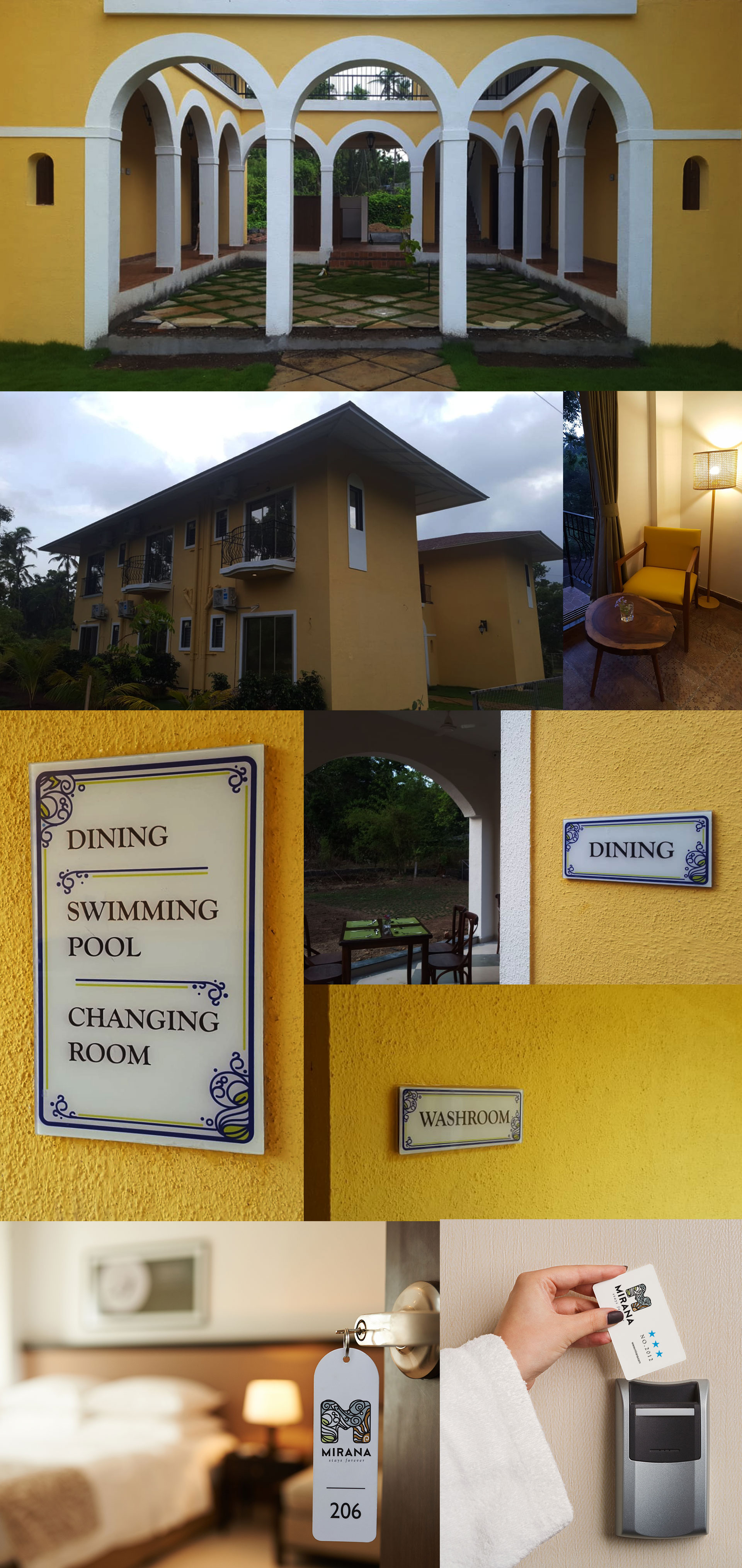
Mirana Resort, as the name suggests, is a world-class resort. It welcomes guests from all over the world. It has a subtle and calm vibe on its campus. The resort provides guests with an opportunity to mingle with nature. It gives a chance to practice meditation. Along with it has a chic vibe that the visuals showcase.
Brand identity:
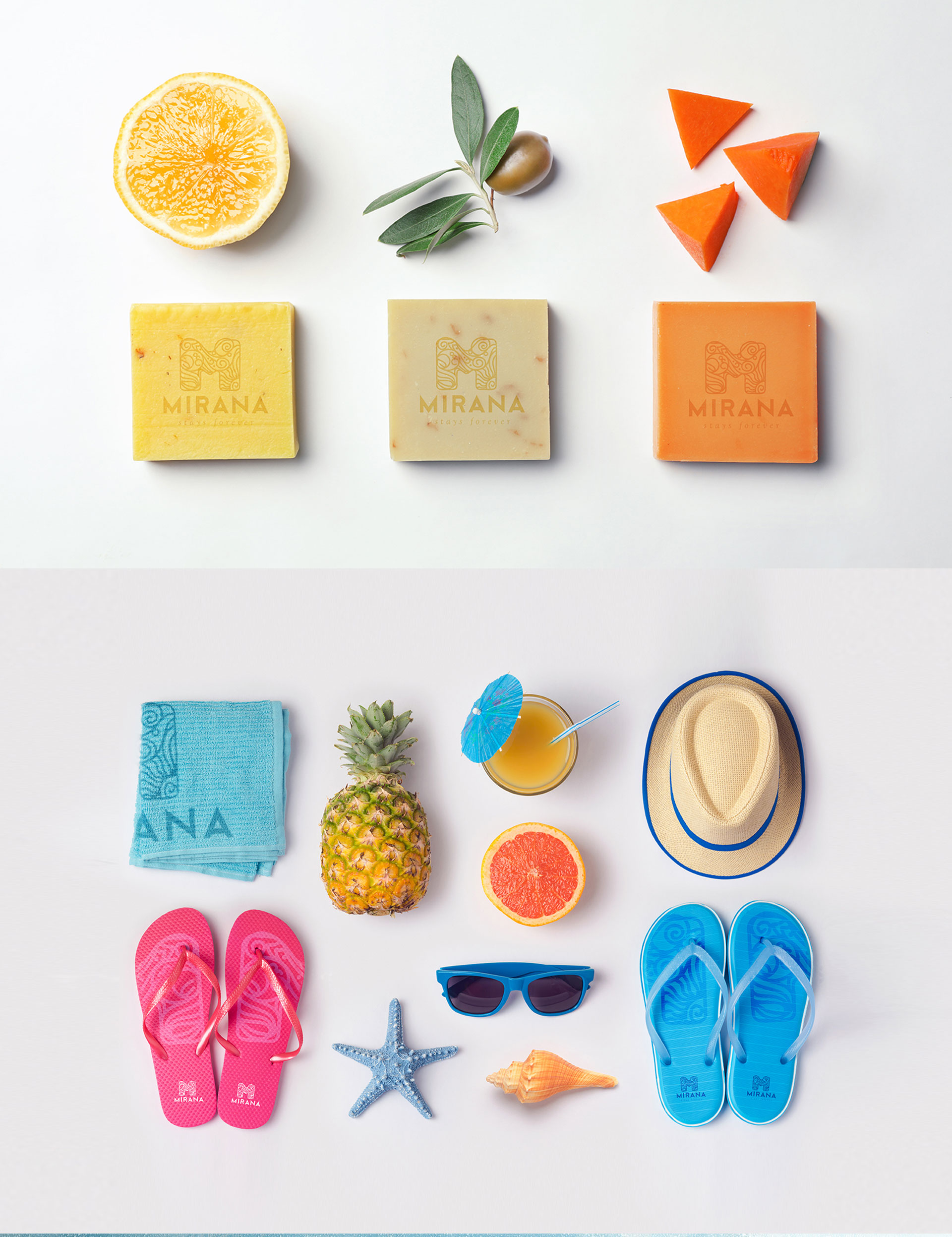
The resort is present amidst nature. That is why we thought of combining all the elements that the resort lets you feel during your stay. “WATER,” “AIR,” “EARTH”, and “FIRE” when combined form a relaxing environment. This intrigued us and we wanted to show it in the brand design
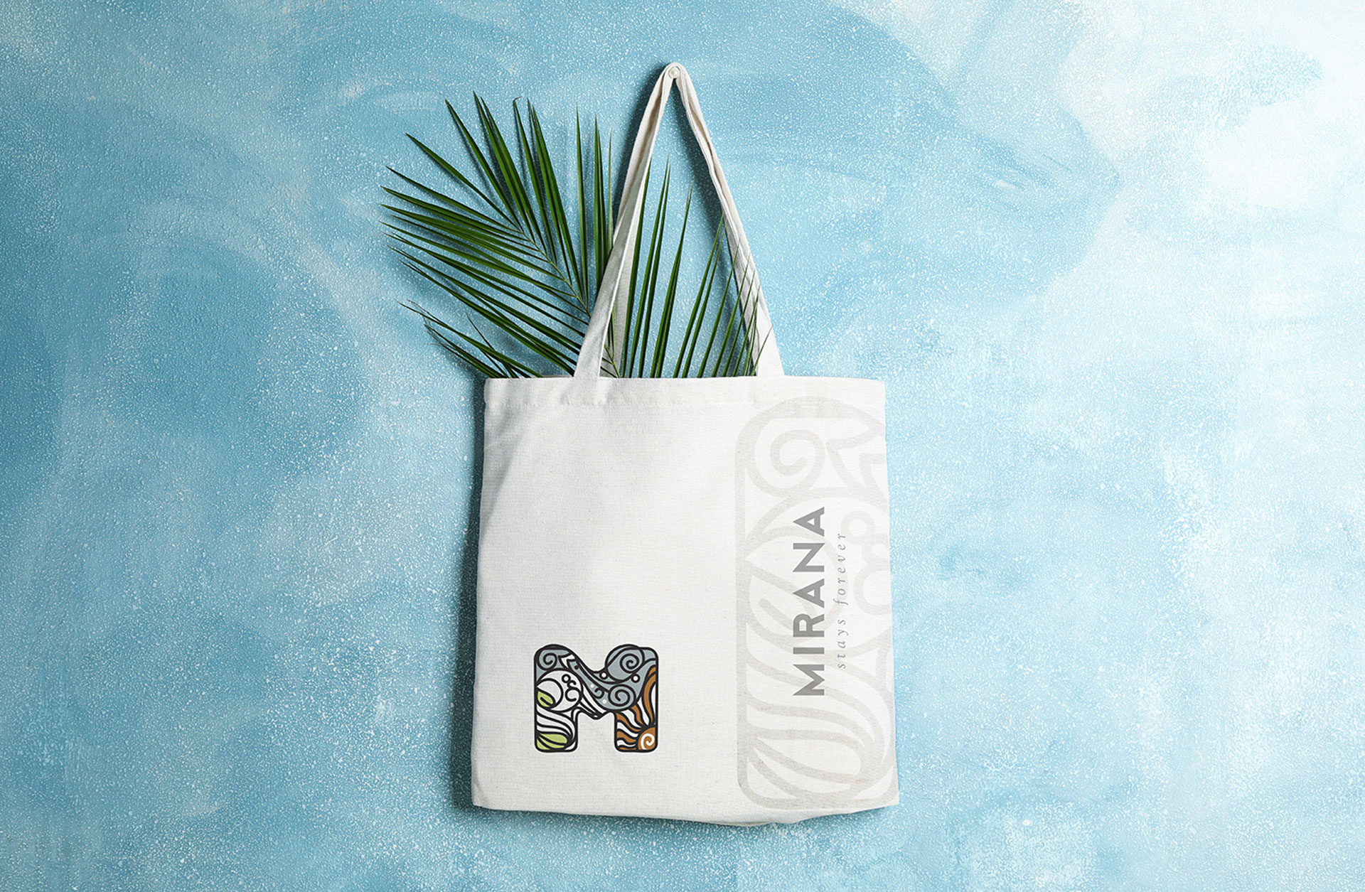
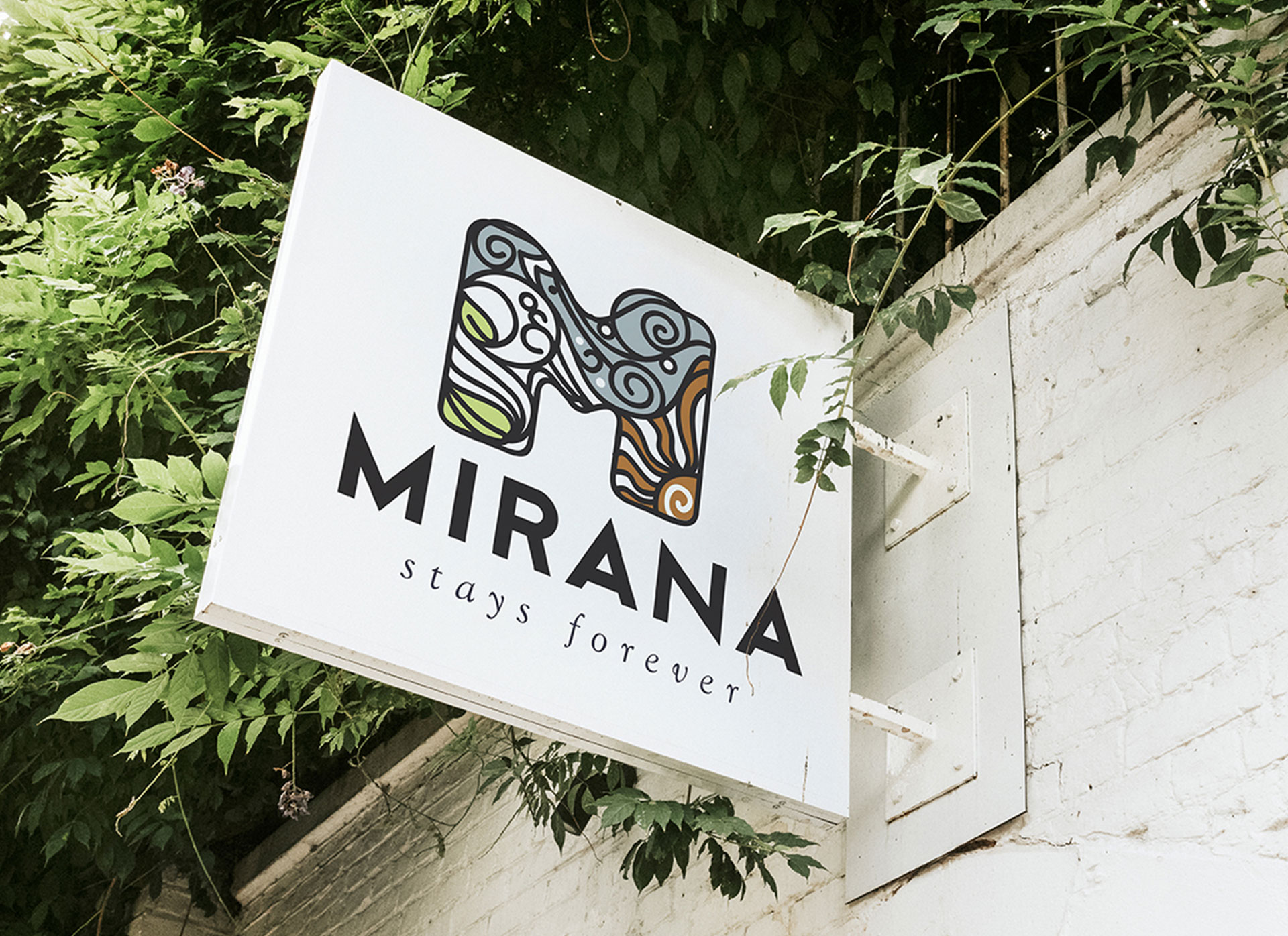
The logo beautifully depicts how elements exist and interact with each other.
The tagline suggests the idea that the feeling that guests feel during their stay is going to stay with them long after they leave.
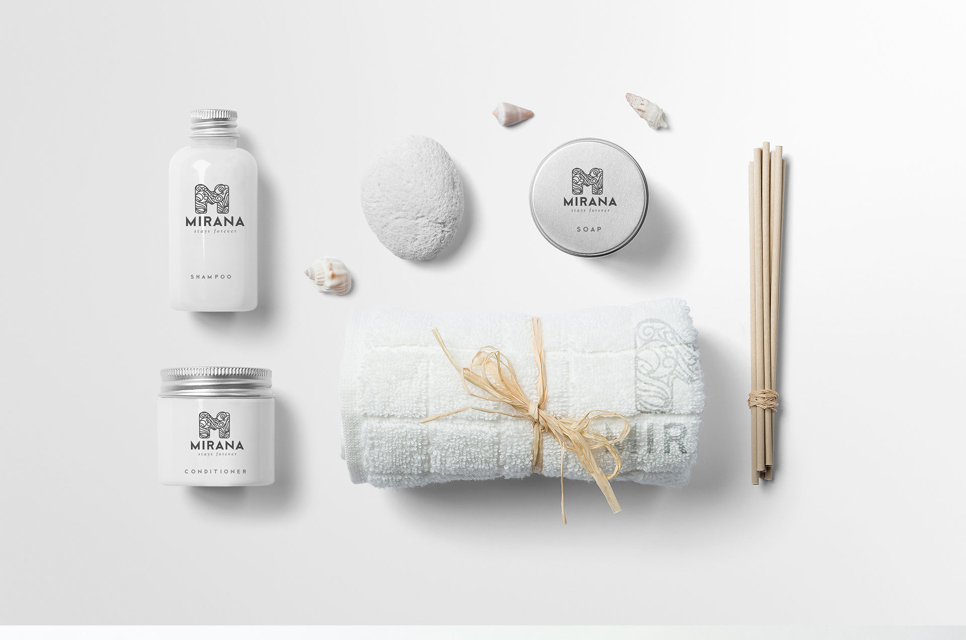
The patterns we created based on the initial design look good wherever they are placed. The design is an essence of the experience the resort offers.