Branding
Get It Rent
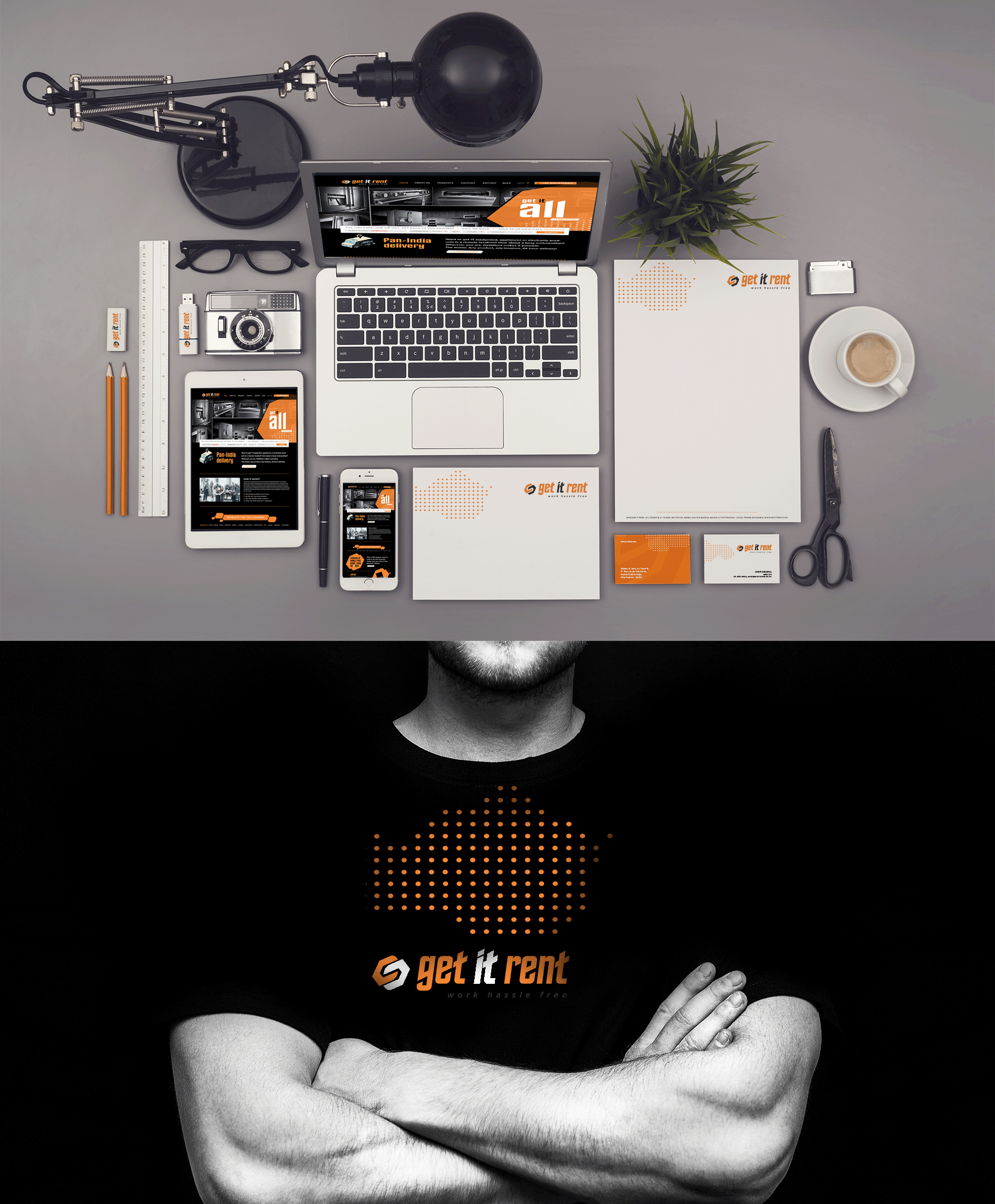
At times rebranding can be more challenging than creating something from scratch. Especially if it’s for a brand that operates in a very niche category. The task here was to revamp the look and feel of this tech rental brand and give it a fresh vibrant look that can appeal to the younger crowd. We kept the primary visual element intact but gave it a twist with cheerful colours and softer edges. The typography was also carefully chosen to signify the cutting edge solution that this brand provides. We also developed a mascot called ‘Rentron’ to be the voice or face of the brand.
Scope: Branding, Communication, Strategy, Logo Design
Challenge
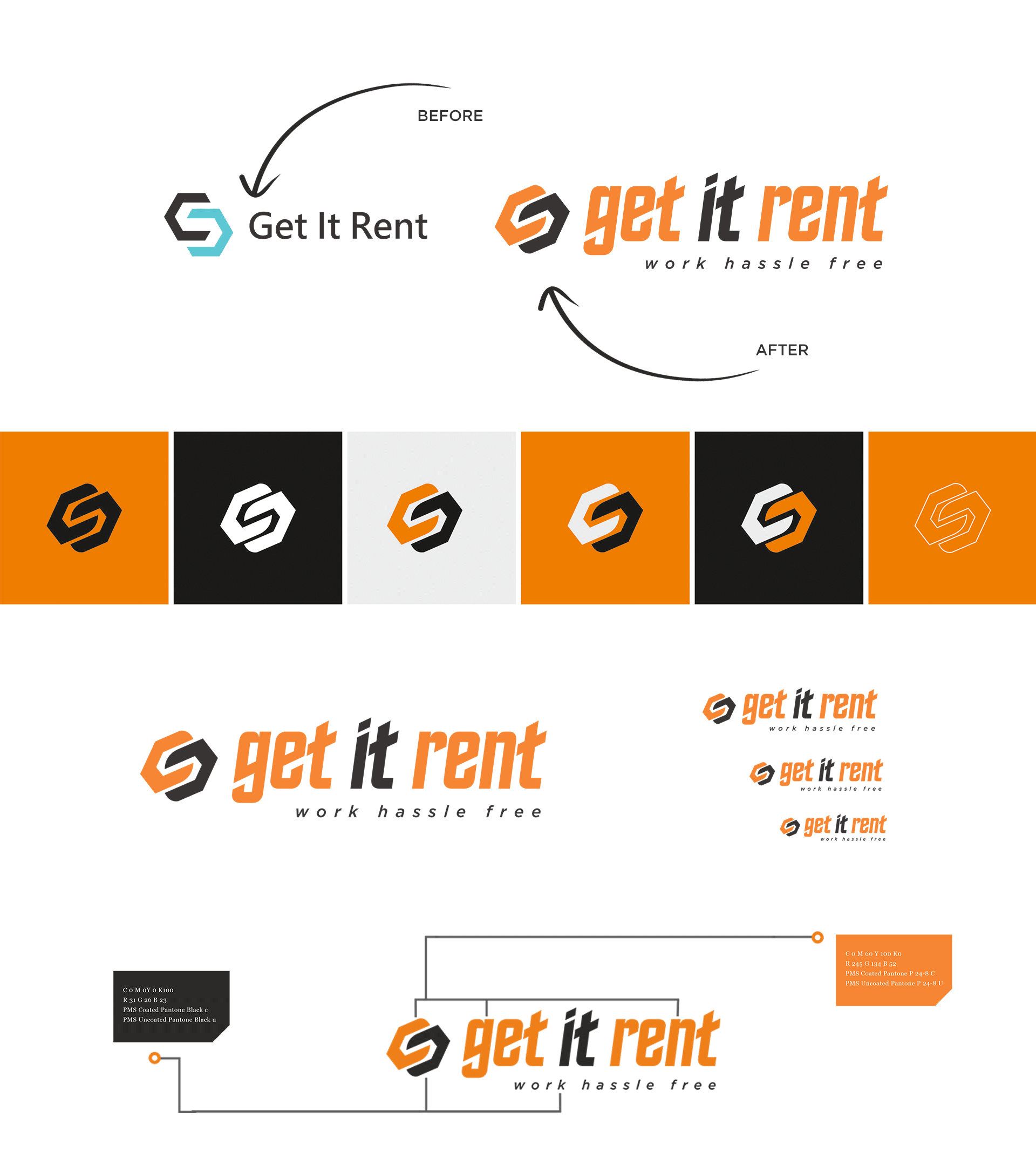
We had a challenge at hand. We had to redesign the entire brand identity for “Get It rent.” The existing logo lacked a few things. It needed a fresh and vibrant vibe to it. The brand wanted to target a younger audience and thus needed an urgent redesign. The typography needed to give a sense of movement.
The brand had a previous design and design elements that represented the business but lacked appeal. We kept the initial graphical element intact and transformed it to look cheerful with soft edges. We selected the typography carefully to match the vibe of the brand. We designed the mascot named ‘Renton’ with a similar idea in mind. It appears to be a fun and cheerful character. The character which is a robot represents the brand perfectly.
Our collaboration was successfully executed and resulted in a brand-new brand identity for ‘Get It Rent.’ It was a learning experience for both teams