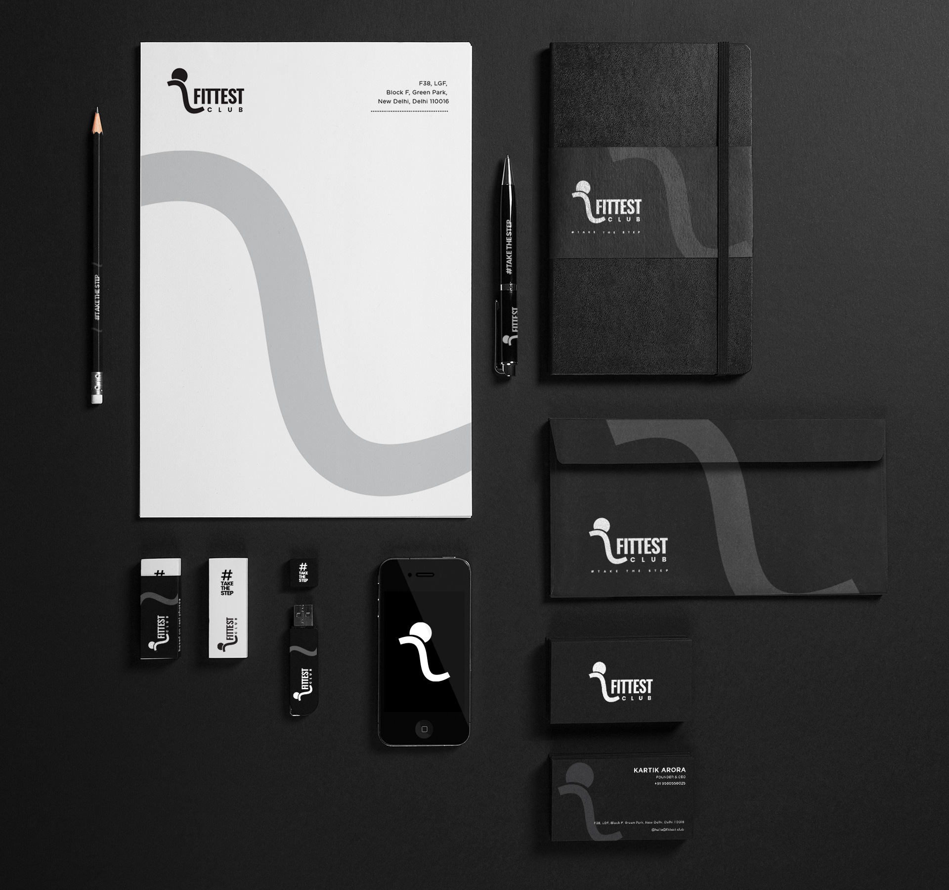
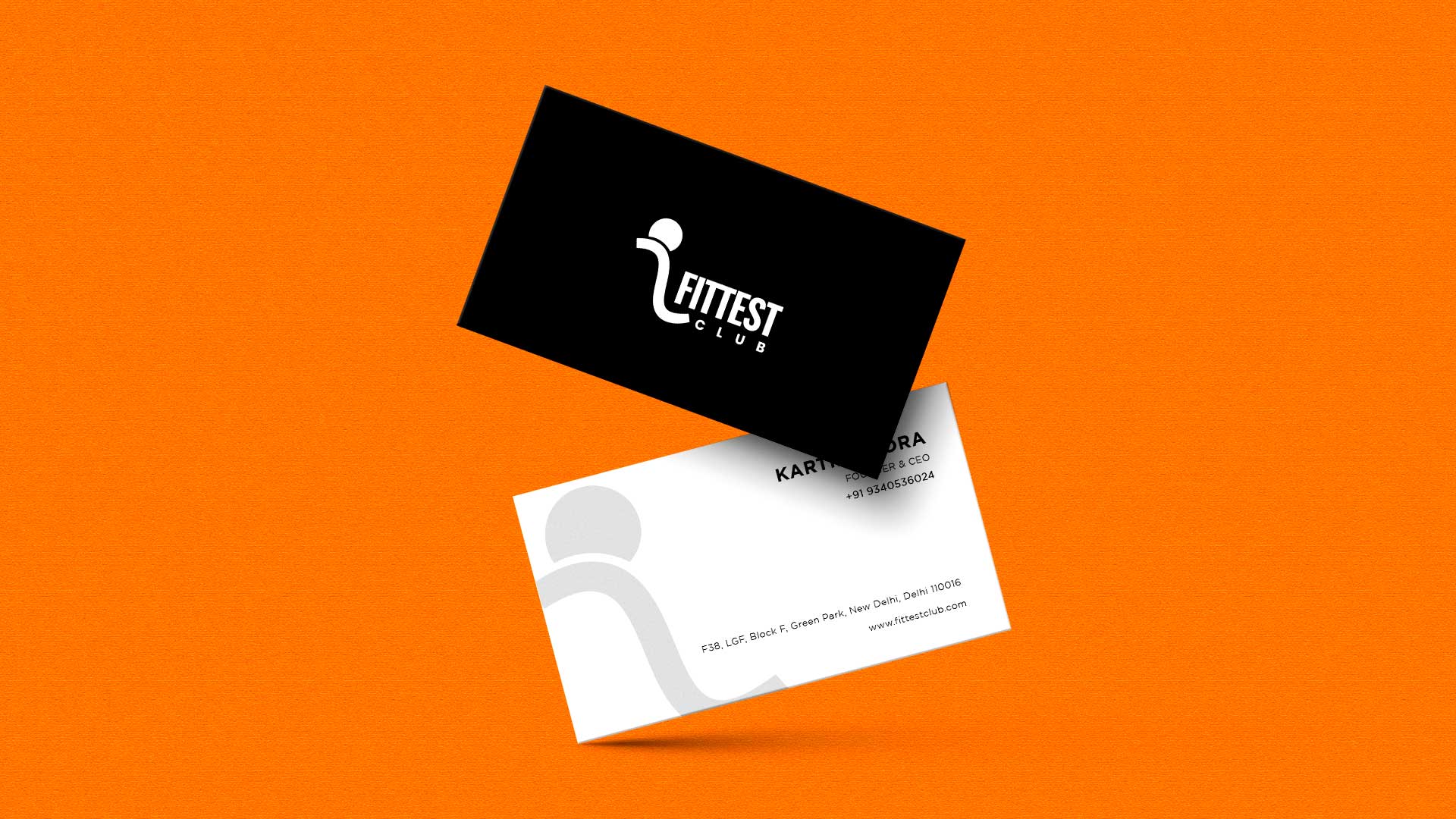
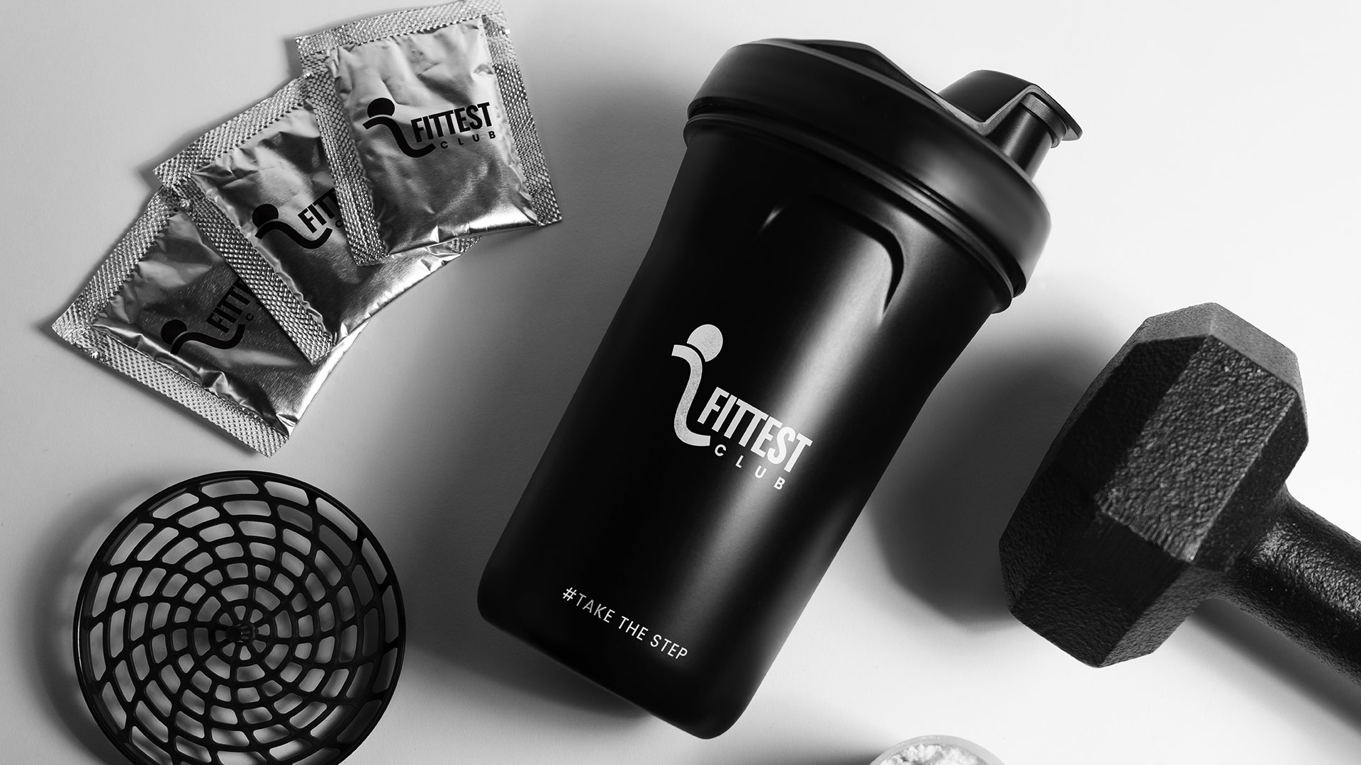
Branding
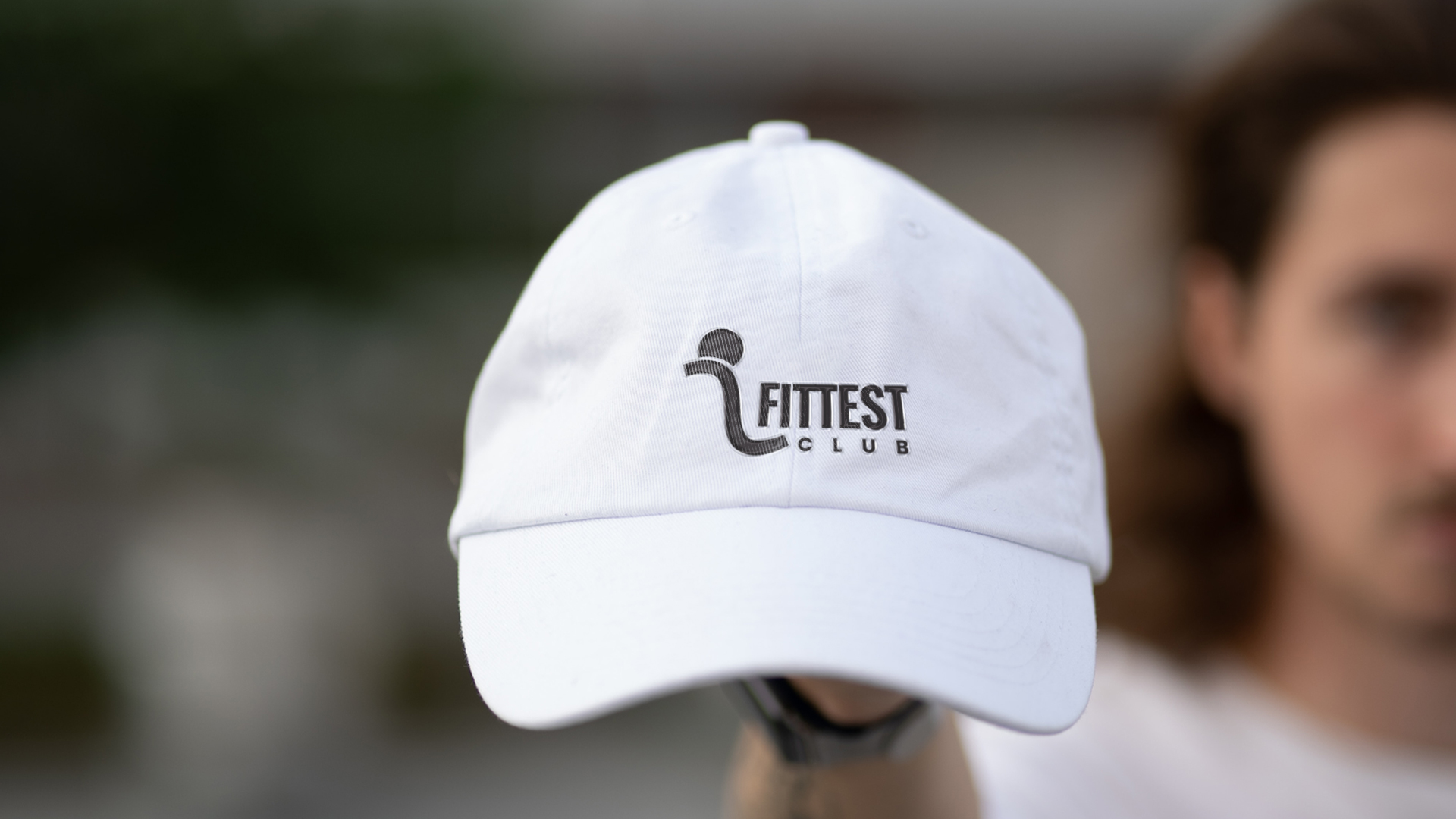
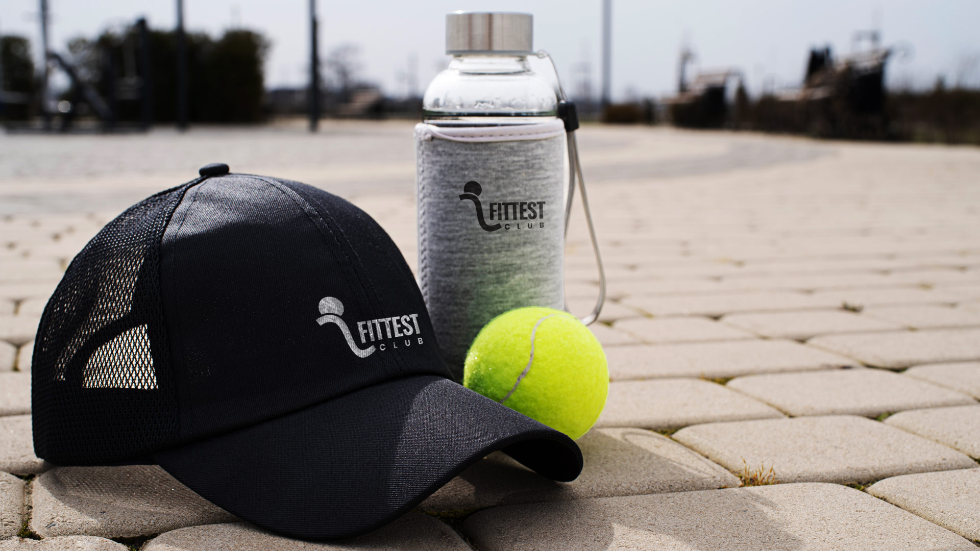
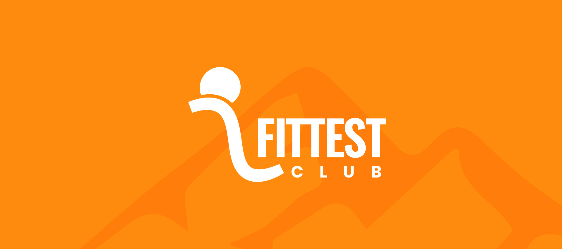
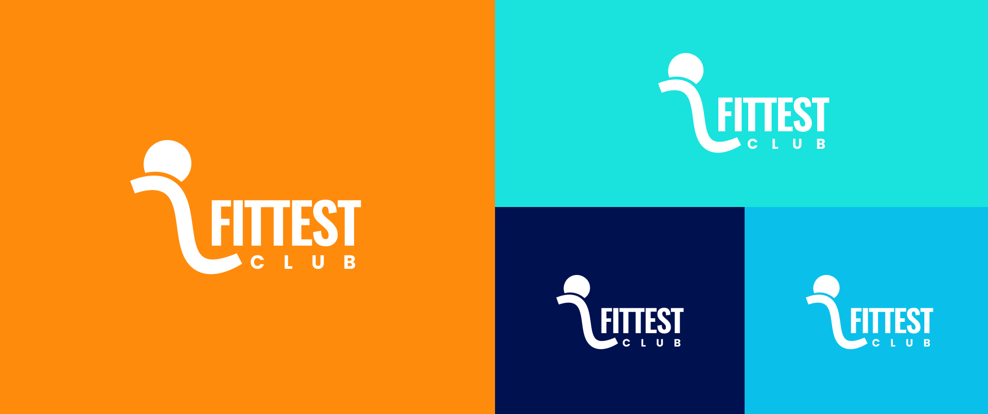
Fittest Club
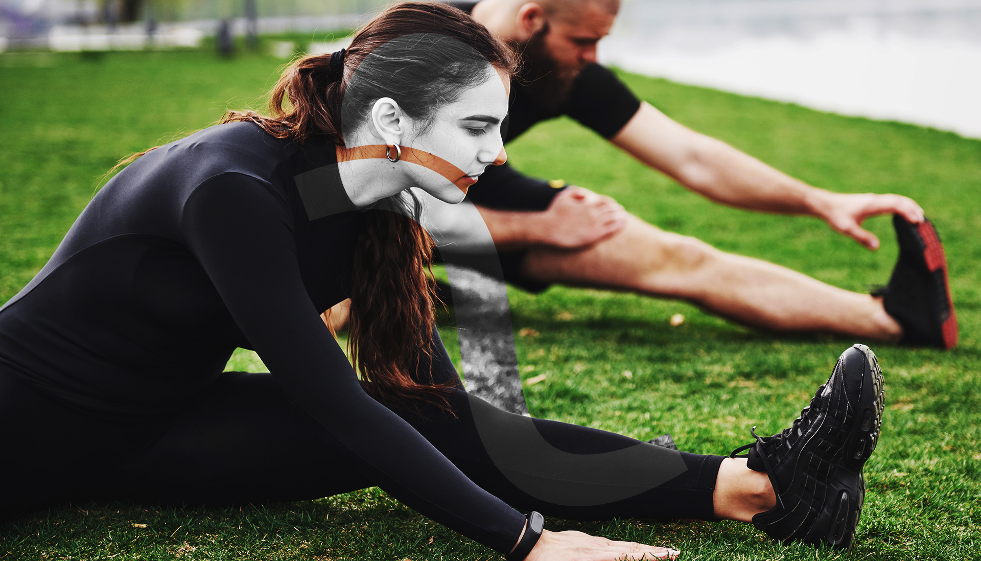
Fittest Club stands as a mindful wellness brand, dedicated to supporting individuals who embrace active lifestyles. Our offerings include top-tier activewear, engaging virtual challenges, and a compassionate community, all crafted to assist you in achieving your fitness goals and enhancing your overall well-being.
Scope: Brand Communication, Packaging Design, Logo Design, Branding, Illustration
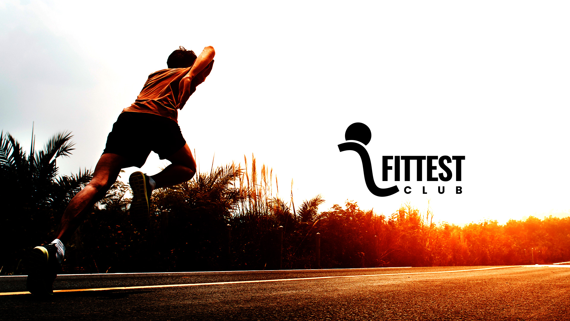
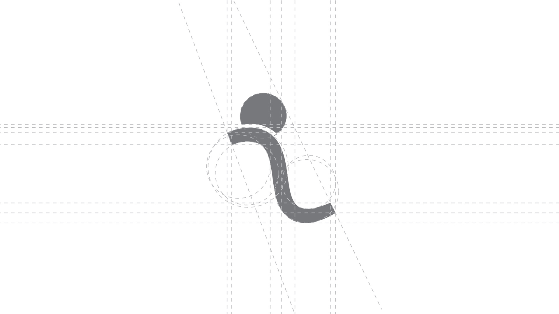

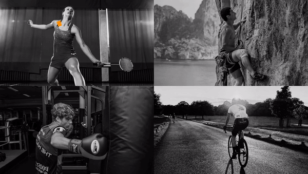
At the heart of our brand lies the profound essence of "fitness," intricately woven into the challenges that have sculpted our existence and acted as a catalyst for transformation. This fundamental concept finds visual representation in our emblem, featuring a boulder and a hill. The symbolism is profound—raising and propelling the boulder upwards embodies the infusion of potential energy. The pivotal moment unfolds as either the user or the boulder ventures on the downhill journey, embracing the challenge and setting the wheels of change into motion.
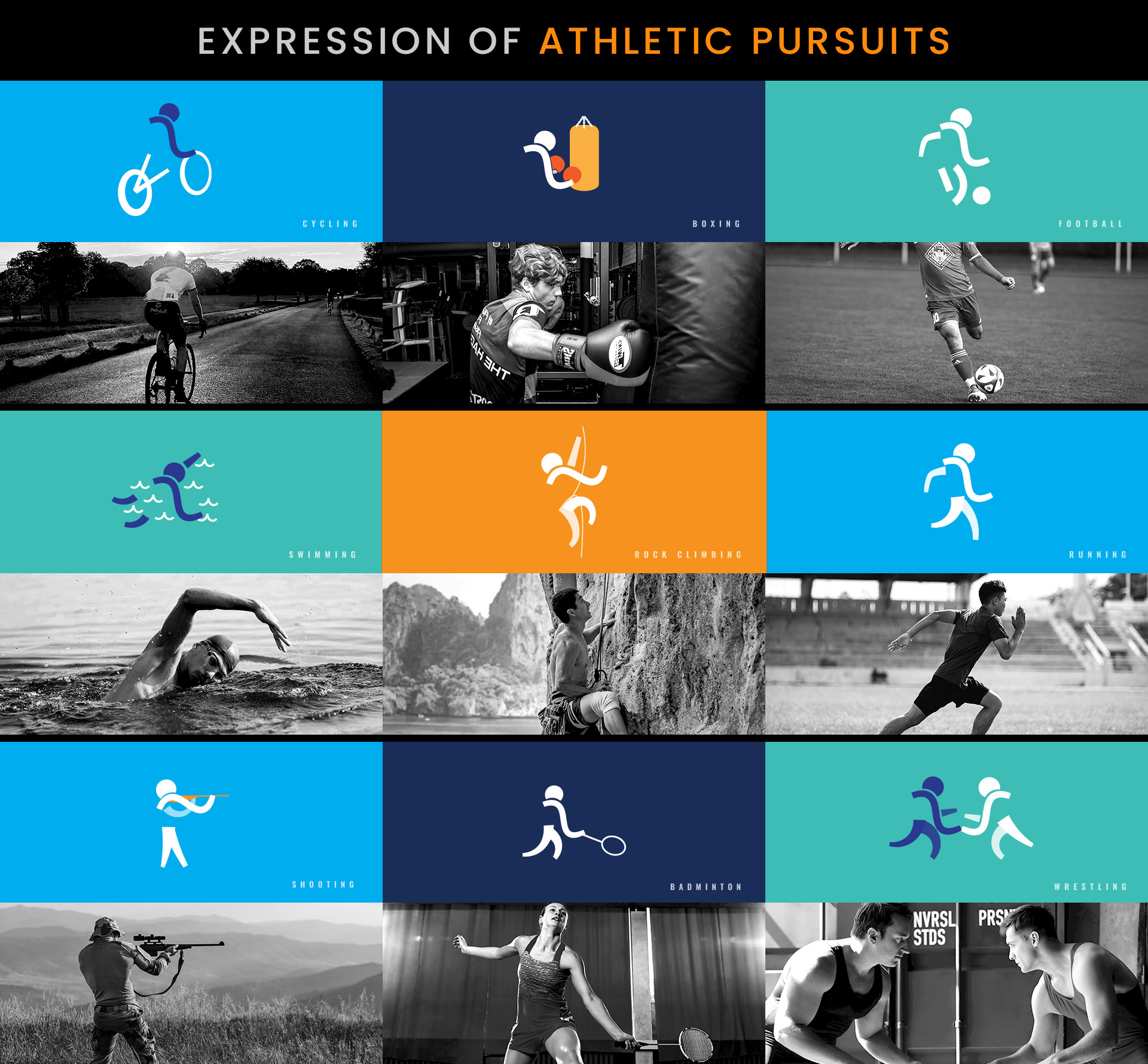
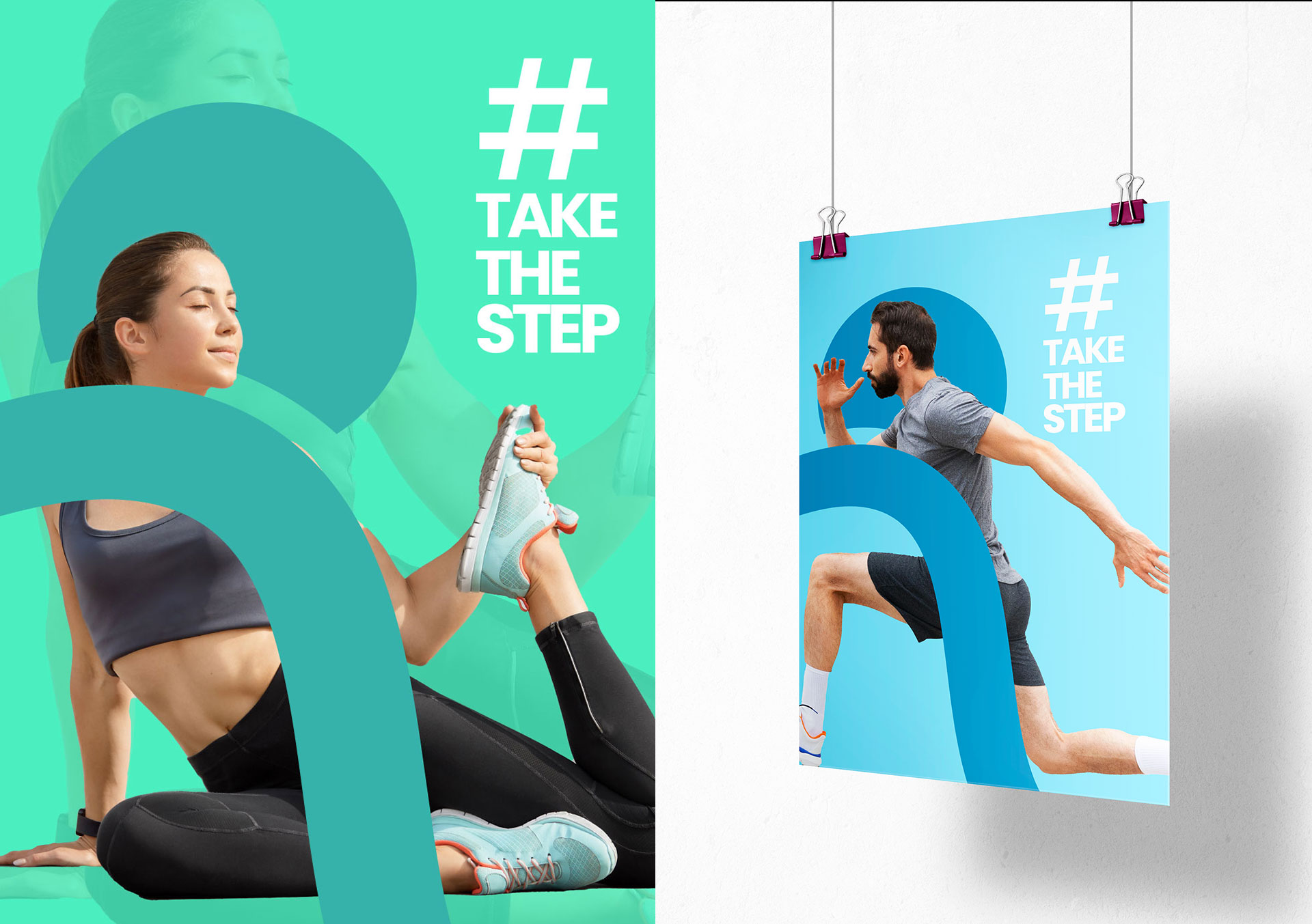
In a continued commitment to our theme as a challenge-centric brand, we take a progressive step by evolving our logo into figurative representations. These figures dynamically adapt to mirror the diverse expressions of athletic pursuits that individuals undertake on their journey to attain the title of the fittest. This transformation captures the spirit of our brand, reflecting the multitude of challenges and triumphs inherent in the pursuit of optimal fitness.