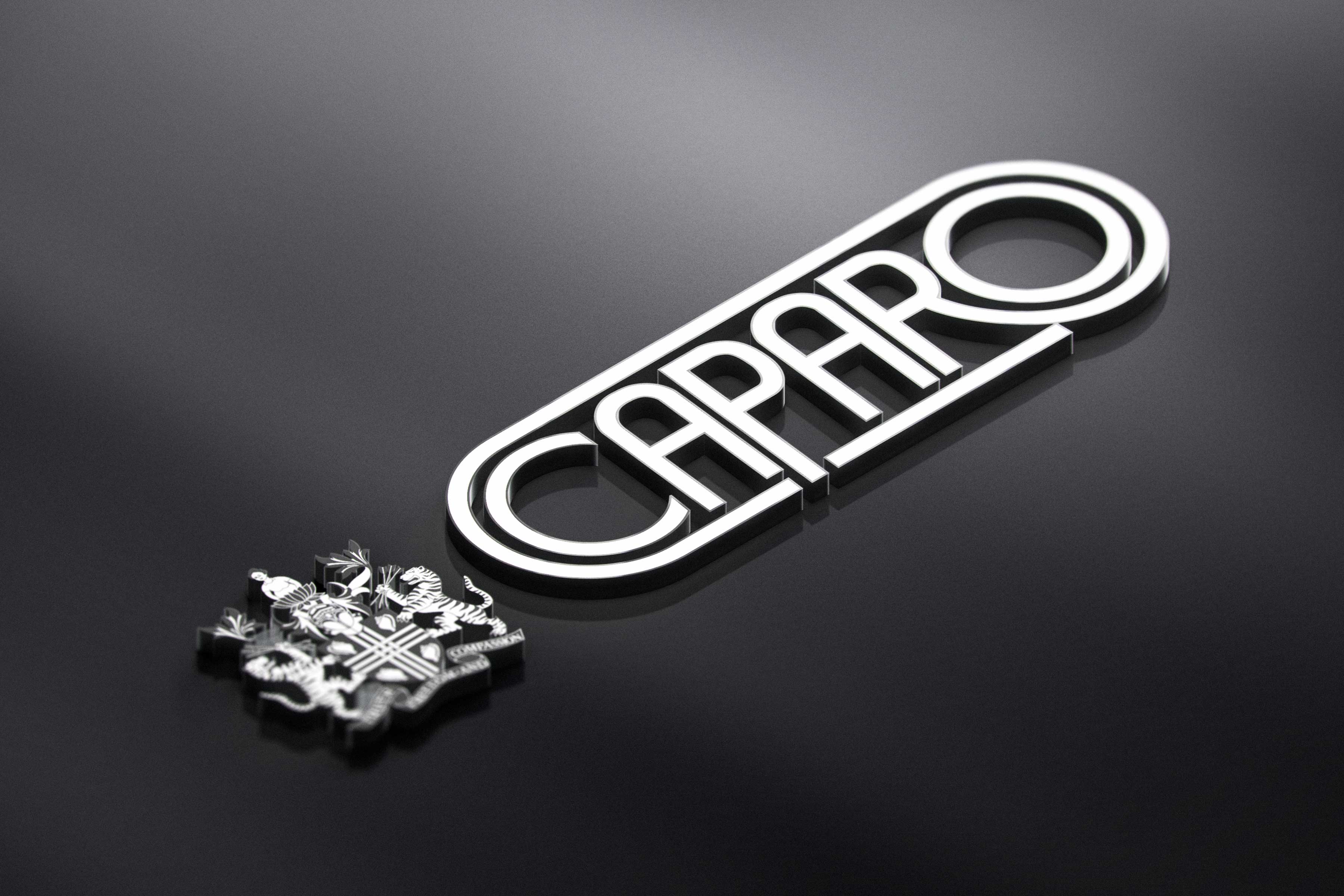
Branding
Caparo India
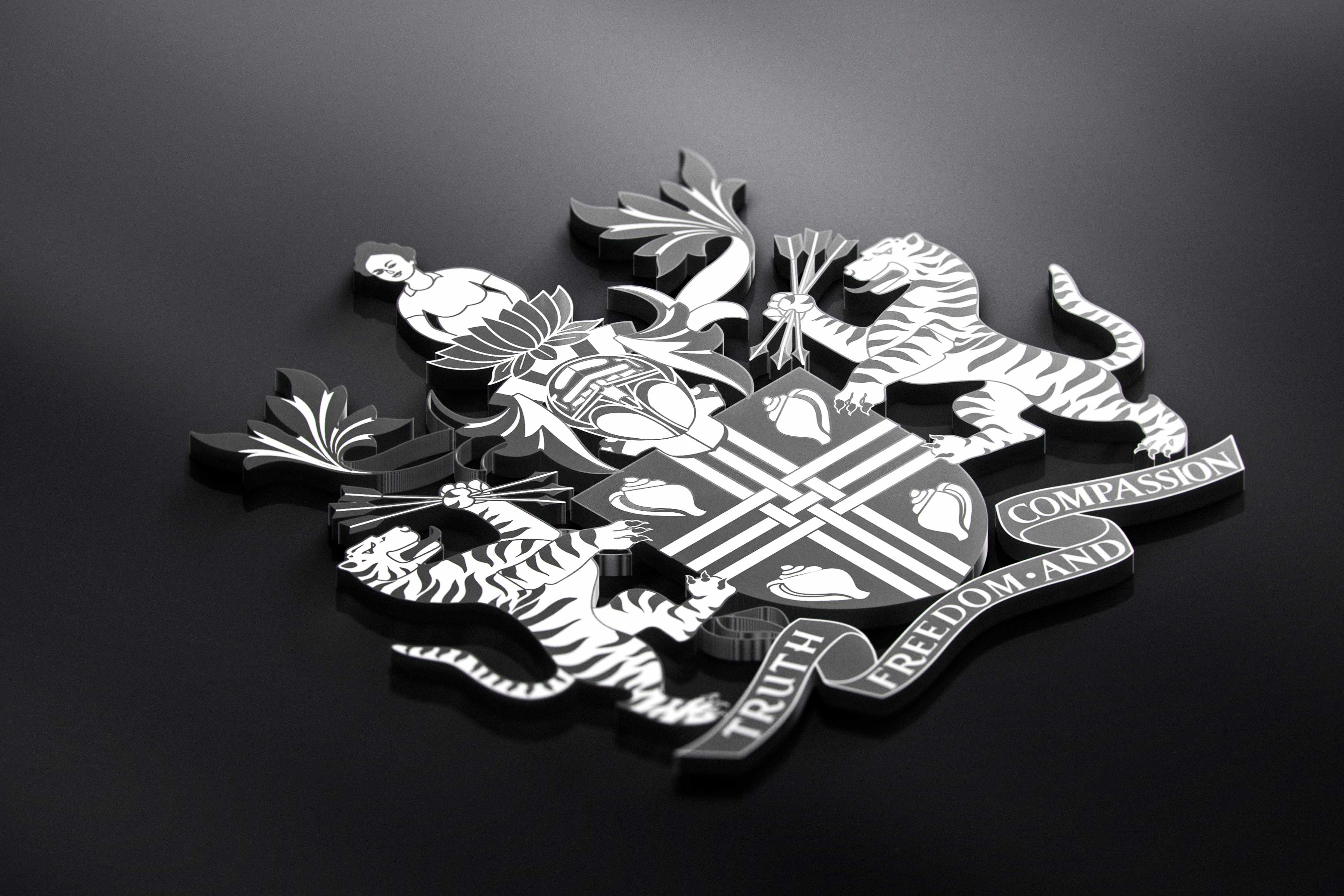
Caparo India, is a conglomerate started in 1994 as a joint venture with the largest car manufacturing company, Maruti Suzuki India Limited. Vena Cava created a brand manual keeping in mind the strong sense of identity across each brand under the Caparo India Group as well as a sense of uniformity. A corporate theme is used across the brand profile with minimalist geometrical patterns, bold color and font to reflect the brand’s strong commitment towards their customers. A sense of trust and legacy in the automative industry.
Scope: Brand Strategy, Communication, Brand System
CAPARO India
Caparo India is the Indian business arm of the Caparo group. They began operating in India in 1994, as a joint venture with India's largest car manufacturer, Maruti Suzuki India Limited.
Today, they have multiple strategic business entities. They offer services in design and development. and Manufacture of automotive systems, assemblies, modules and components for Automotive OEMs and Engineering majors.
The top-notch clients in the domestic region are Maruti Suzuki, Suzuki Motors, M G Motors, Renault -Nissan, Honda Cars, Tata Motors, Tata Cummins, Volvo Eicher, Ashok Leyland, Mahindra & Mahindra, Daimler, Force Motor Ltd, Hyundai Constructions, TAFE, JCB, Escorts, Kubota, CNH, Yanmar, International Tractors, New Holland Tractors, Royal Enfield, HMSI, Indian Railways, Vehicle Factory Jabalpur, Bombardier Transportation, Gabriel India, Denso, Automotive Axles, Gilbarco, Iljin, Woosu, Rane TRW and on the international front, the major clientele include: BorgWarner USA, Honeywell USA, JCB Ltd USA, UK, HYG USA, Berrang France, Wurth S. Africa, Wayne Brazil, Spain, Caterpillar/Perkins, etc.
Scope: Brand Identity, Communication, branding, strategy, logo design

Brand Identity:
The brand colours we used were based on the International standard Pantone Matching System (PMS).
The logos had to be made fit for distinct business entities of “Caparo”
The typeface we used is GOTHAM. We created patterns taking inspiration from “Maruti”. As they are India’s biggest car manufacturers. We created it with the idea of motion and mobility. Circles represent wheels which are our main graphics.
We illustrated distinct patterns for distinct business entities of “Caparo.”
For Creating these patterns, we took inspiration from different sources. Hence, we developed graphical patterns which are in sync with the industry where each brand operates while maintaining a single theme that ties them all back together as a member of the “CAPARO” family.
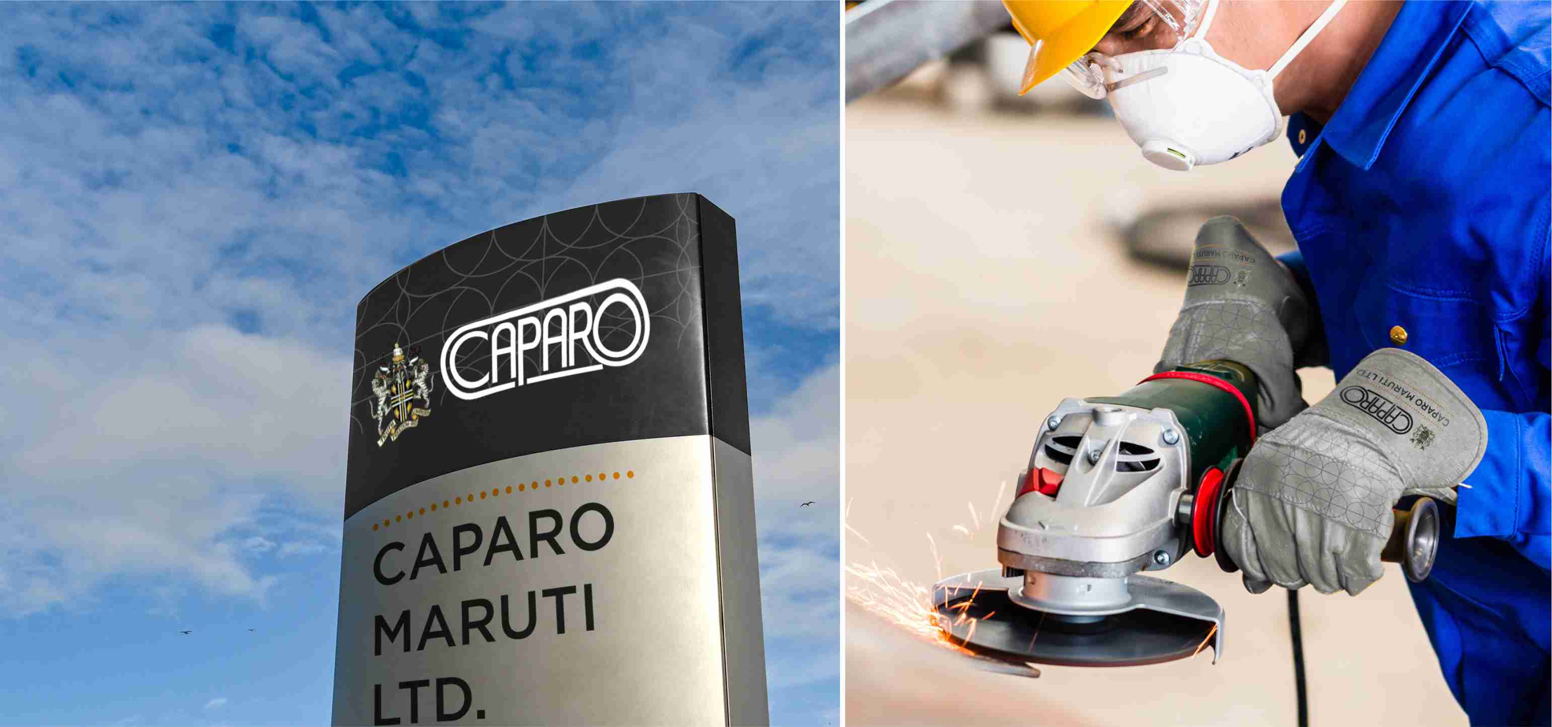
We took inspiration from wheels symbolizing mobility for “CAPARO MARUTI LTD”.
We took inspiration from bricks symbolizing the connection for “CAPARO ENGINEERING INDIA LTD.”
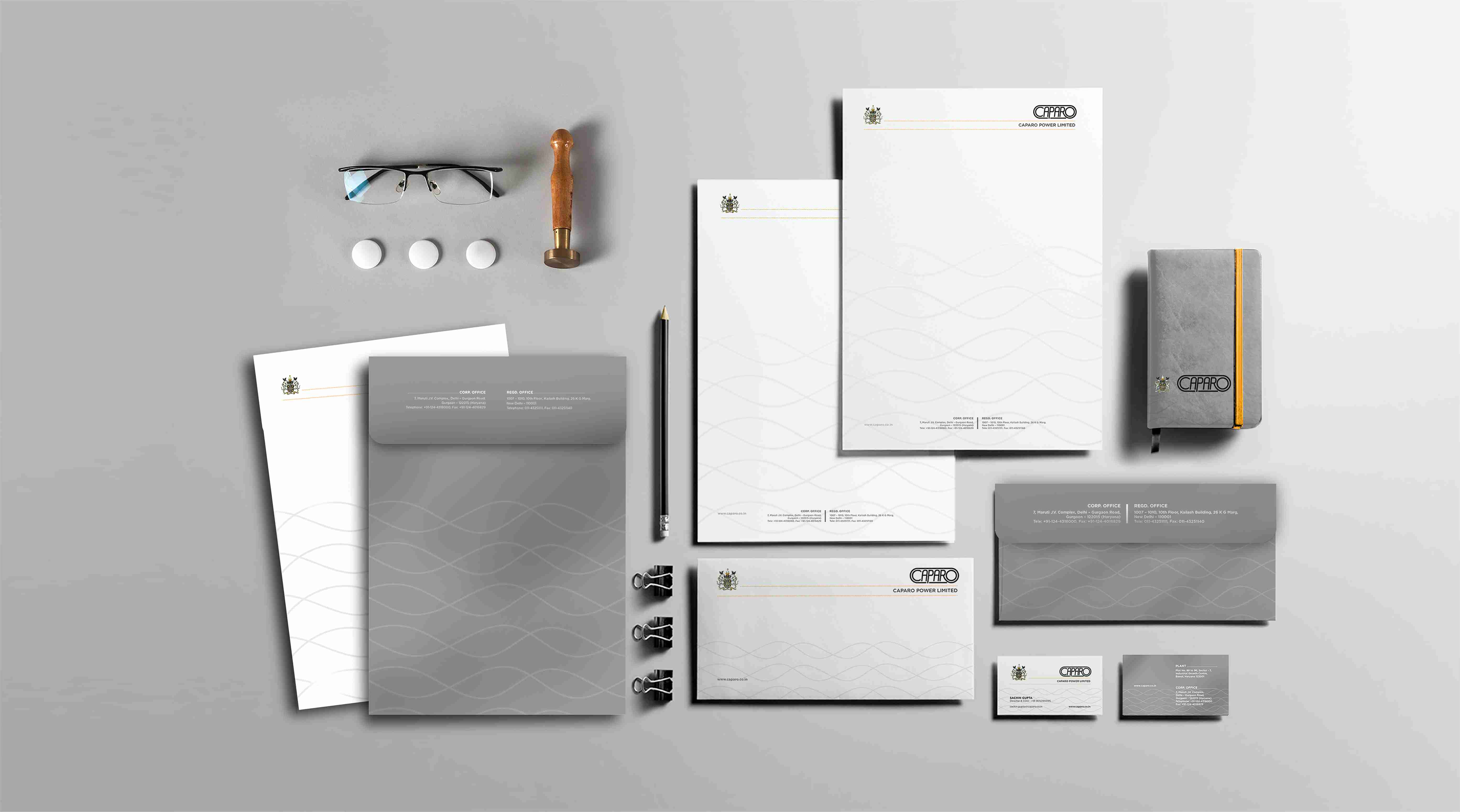
We took inspiration from waves which reminded us of sinusoidal waves in which power or electricity flows for “CAPARO POWER LTD.”
We took inspiration from steel symbolizing strength and preciousness, which again reminded us of diamonds for “CAPARO MI STEEL PROCESSING LTD.”
We again took inspiration from bricks symbolizing the foundation for “CAPARO INDIA LTD.”
We created a pattern symbolising the connection between people for “CAPARO PROCAM INFRASTRUCTURE LTD.”
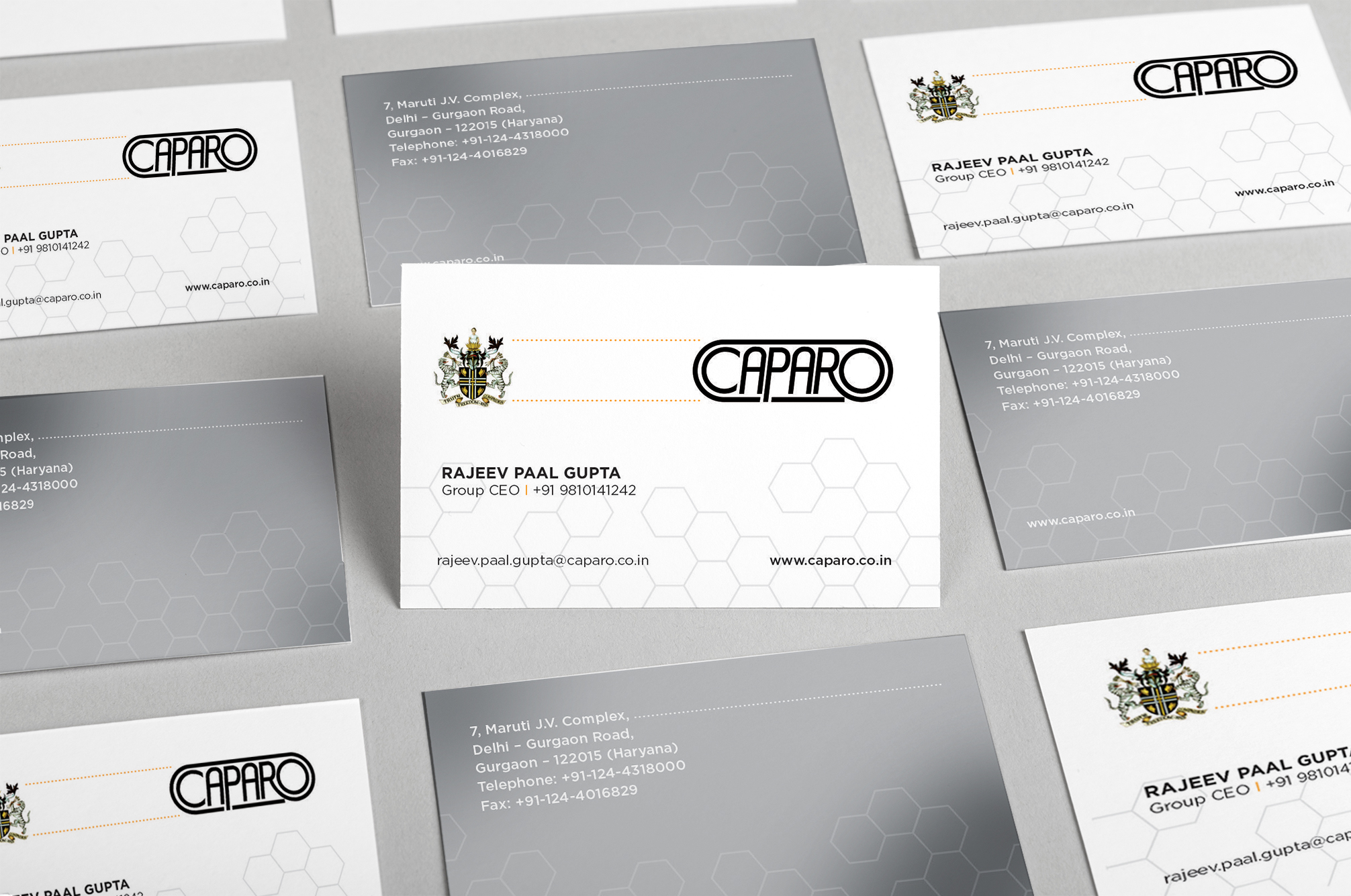
We took inspiration from a honeycomb symbolizing many entities working together for “CAPARO CORPORATE SERVICE.”
We put our constant effort while working on this project. All throughout the process we were supported by the CAPARO team. We tried to bring out the significant character CAPARO GROUP plays in the development of economy. Our honest though process and strategic planning gave the desired creative results.