Branding
Barnshenn
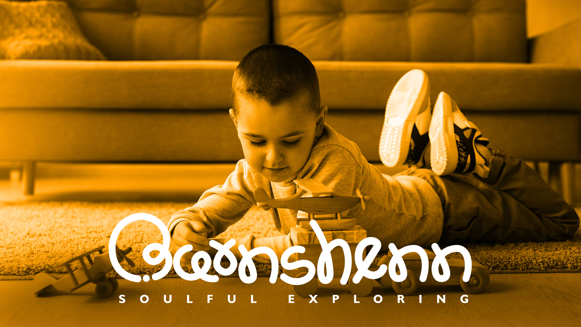
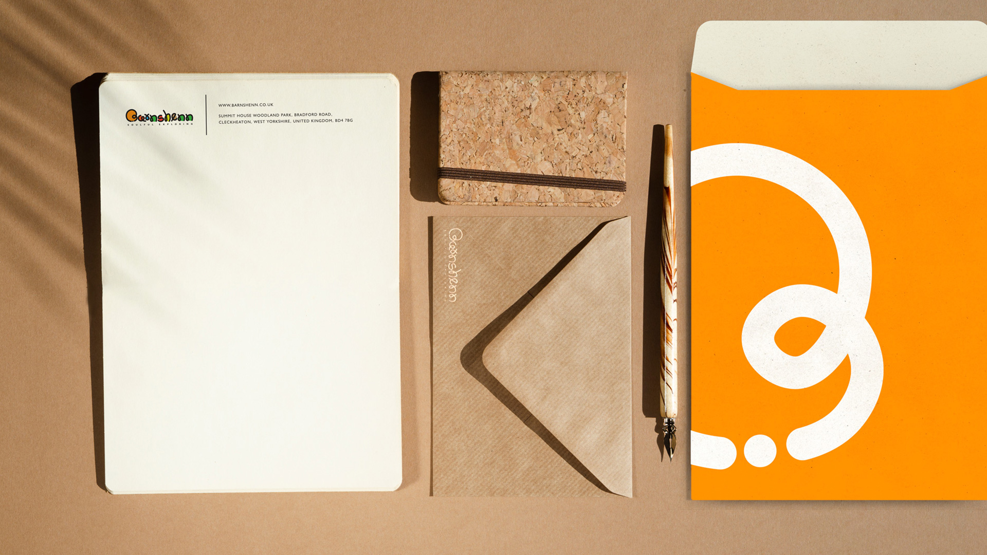
In collaboration with Barnshenn, an inspiring toy brand that specializes in eco-friendly wooden toys for kids, we embarked on a journey. With great enthusiasm, we sought to capture the essence of Barnshenn's values and ignite the spirit of a child's exploration through our creative process.
Scope: Brand identity, Communication, Branding, Strategy, Logo Design


Crafting the Brand Identity:
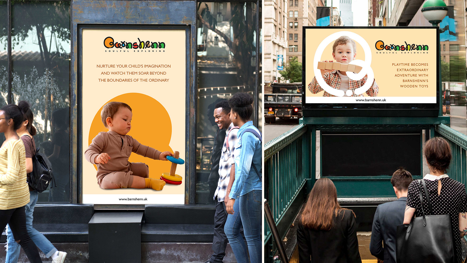
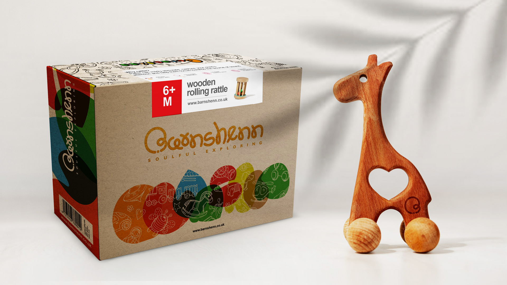
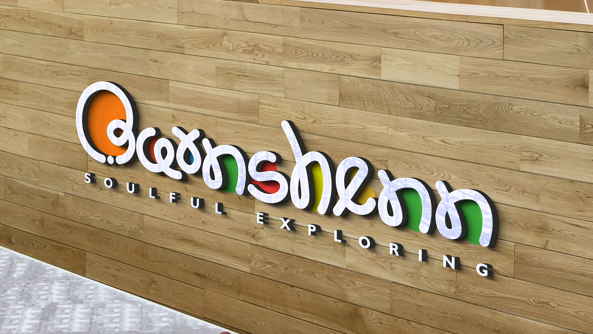
Our objective was to fashion a visual identity that seamlessly blended tradition and contemporary elements, embracing the modern generation while exuding timeless appeal. By infusing the logo with an air of playfulness and boundless creativity, we aimed to reflect the joyous and uninhibited nature of childhood.

Color Palette:
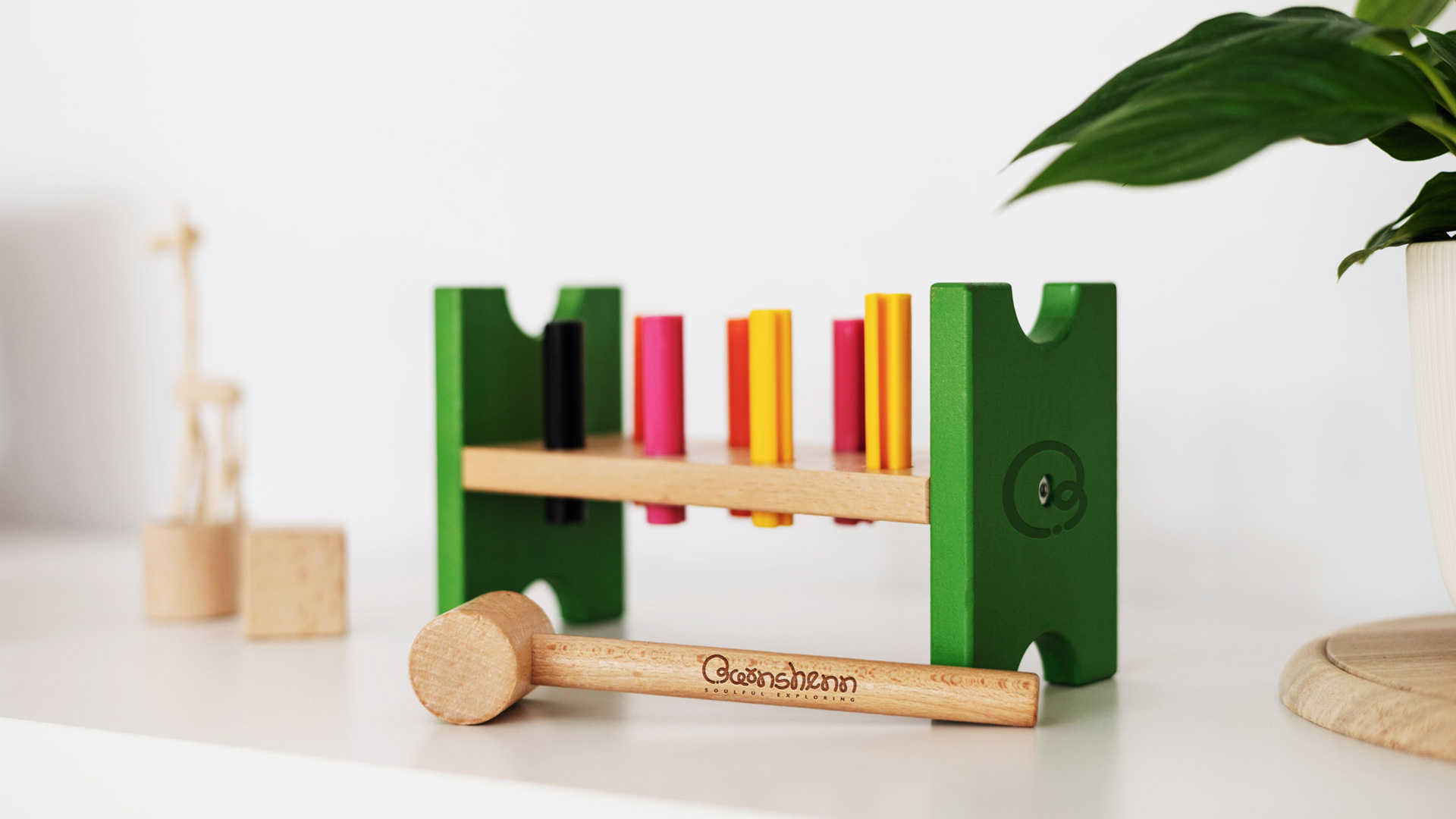
Deliberating over the color palette, we curated a harmonious blend of hues that evoke feelings of tranquility, purity, and sustainability. Earthy tones and shades of green were carefully chosen to symbolize Barnshenn's unwavering commitment to eco-friendliness and their vision of shaping a sustainable future for children. These colors exude warmth and approachability, beckoning both children and parents to embark on a soulful exploration journey with Barnshenn.

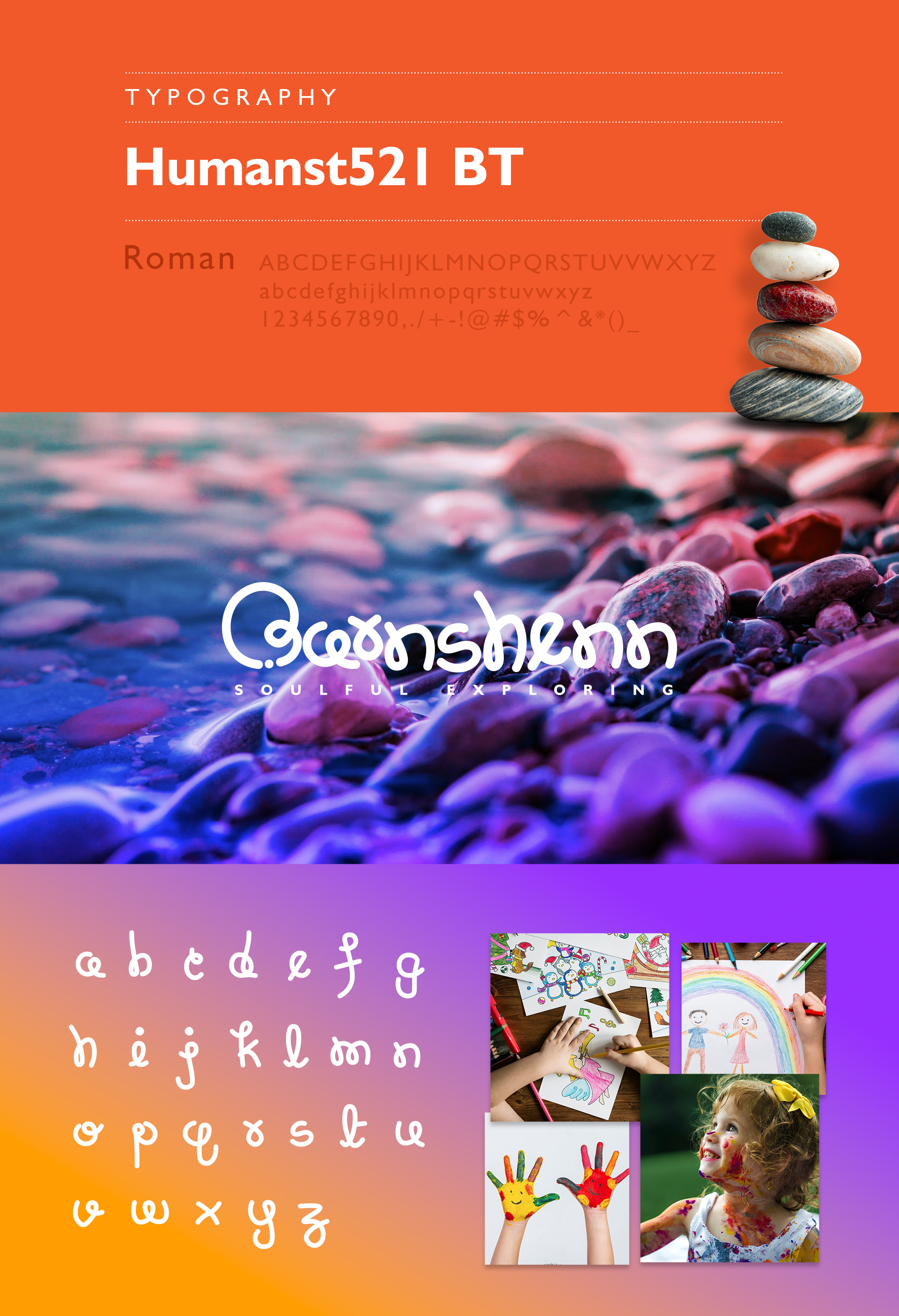
Typography:
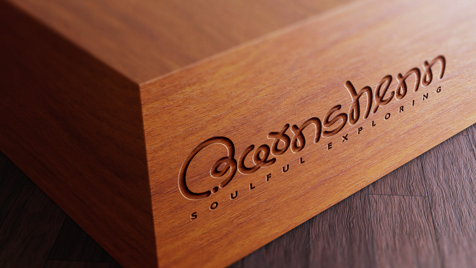
Drawing inspiration from the whimsical strokes of a child's paintbrush, we meticulously crafted a unique typography that mirrored their uninhibited creativity. Through graceful loops and fluid lines, we sought to evoke the sparkling and untarnished minds of children, transporting viewers into a world brimming with limitless imagination.
Symbolic Elements:
To deepen the logo's meaning and forge a profound connection, we thoughtfully incorporated symbolic elements that embody the soulful exploration of children. These elements, reminiscent of the rocks children often incorporate into their imaginative creations, symbolize the very building blocks of imagination and boundless possibilities. By seamlessly integrating these elements, we aimed to instill depth and resonance within the logo, aligning perfectly with Barnshenn's mission of nurturing possibilities, one exploration at a time.


Conclusion:
In conclusion, the logo we crafted for Barnshenn encapsulates the very essence of the brand. It seamlessly captures the soulful exploration and untainted minds of children, infusing the logo with a sense of wonder and boundless curiosity. Through our playfully crafted typography, purposefully integrated symbolic elements, and meticulously chosen color palette, the logo stands as a powerful visual representation of Barnshenn's core values. It signifies their unwavering commitment to providing eco-friendly wooden toys and shaping a sustainable future for the modern generation.